THE ONE ROOM CHALLENGE: let's get caught up.
If you follow along on Instagram (or maybe even Facebook), you know that I decided to sign up for the One Room Challenge in mid-September in an effort to finally execute a beautiful design in our guest room by Teri Moore. There are so many things I want to explain, so I’ll start with why this is my first blog post about it even though it’s a 6-week challenge.
Teri’s amazing design.
It’s because we left for Spain one week after the challenge started! In my rush to get packed, get ahead on work, take pictures for Instagram just in case, and generally get our house ready for us to be gone for two weeks, I didn’t even LOOK at the guest room. (Well that’s a lie. I used it to pile all of our clean/unfolded laundry.) So there the room sat, untouched and the same, for weeks 1, 2, and 3.
The day after we got back from Barcelona, and much to Andrew’s surprise, we got started on the room. I was excited, but I was already on week 4. Week 4! We had so much to do. We moved furniture, took down everything on the walls, put in new closet doors, and repainted the room. Also, we had friends over to help us move the rug that was living in our master under our very heavy bed. I purchased all of the accessories I didn’t have yet, and really felt like we had made a ton of progress. But then I remembered: I still had to paint Effie! That was quite the project. (More on this in a future post.)
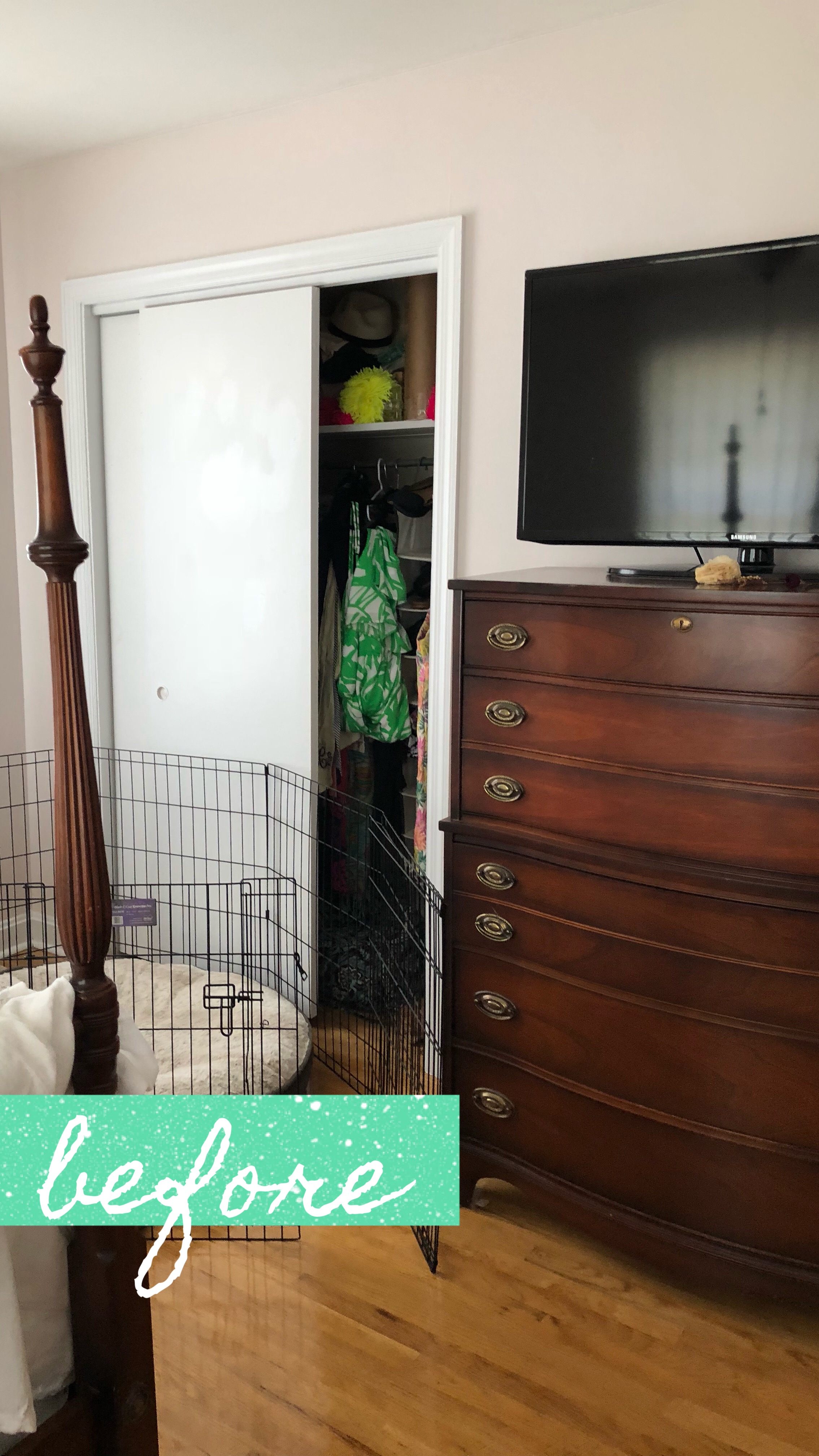
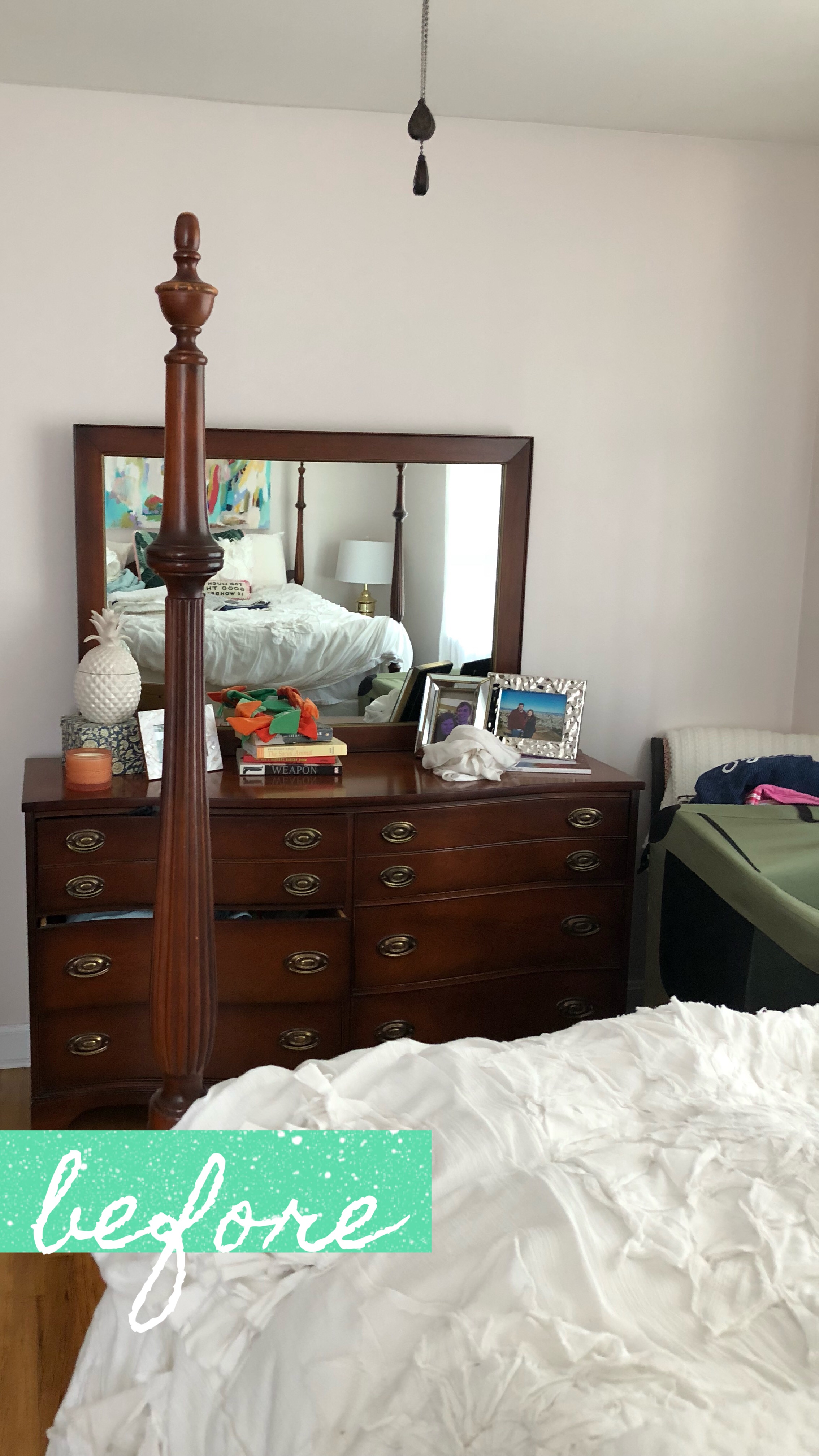
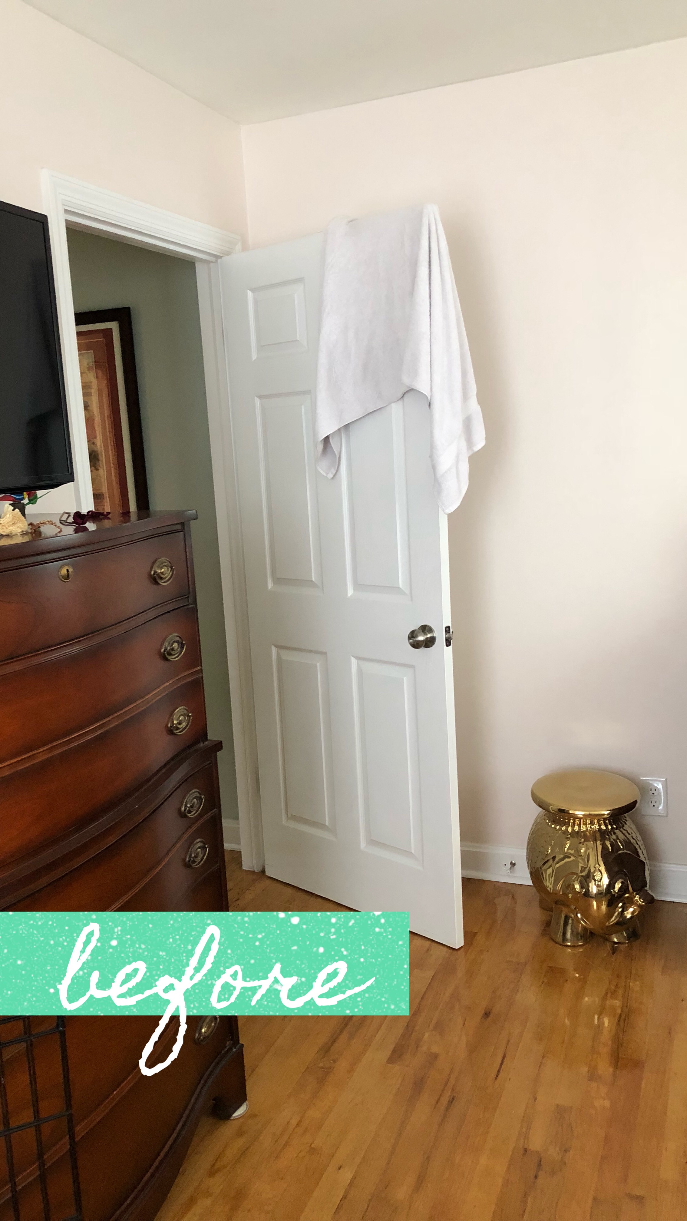
For week 5, it was a race. A total details game, and a waiting game for all of the accessories I had ordered the previous week. I was finishing a 48x48” painting of queen Effie, hanging and steaming curtains, steaming bedding, forgetting things and making multiple trips to the store, and constantly messaging Teri to make sure she was loving the as much as I was. Finally, it came together. 2 and a half weeks of pure insanity, and we pulled it off! Here are the before photos, for your viewing pleasure:
About the design, and my decision to work with Teri:
This guest room has been something I’ve avoided for the two years since we moved in. It was formerly a mix of leftovers- things that didn’t go anymore in other rooms, or didn’t fit. The mattress is amazing- if it wasn’t a double, we would sleep on it! The furniture is also amazing- it’s 1940’s antique, passed down from my Nanny, and very special to me. Those were basically the only amazing things about the room. All in all, it was very blah. The duvet was pretty great, and it has been with me since college, but paired with always mismatched sheets and all varying shades of whites all over the room, it wasn’t making a huge impact.
As much as I loved the furniture, it was hard for me to imagine how I wanted to room to look because the furniture isn’t what I would consider my style. I was struggling to choose curtains, bedding, accessories- I needed help if I was ever going to pull it together. I reached out to Teri and I was worried I would sound crazy: I have a full suite of 1940’s furniture, but I love the Jungalow- midcentury modern look, but also a little chinoiserie. I like color, but not too much, and I need hanging plants. Also, our budget is “as little as possible”. Guess what? I did sound crazy, even though she kindly told me I didn’t, and she came through with all of the things I love! I wish Nanny were here to see the final product. I think she would love it. I’m also so glad I took the leap and invested in Teri’s expertise- I never would have put this together in a million years, but I’m obsessed with it. (And literally a list of links to the products I would need? Yes.) I’ll give myself credit- the portrait was my idea- but I based it around the design, like I do in so many interior projects that aren’t in my house!
Long story short: edesign is worth it, Teri Moore is great at it, and the One Room Challenge is nuts. I can’t wait to show it all off tomorrow! (I’m already geared up for the next one, but Andrew says we’ll see- maybe it was a little more chaotic than I remember.)


